Integration of
“How-to” Assistance
I enjoyed participating in a Hackathon held by my company and working with other team members cross-functionally to generate innovative ideas. The following design concept won the Hackathon of 2021 and got implemented to improve the user experience.

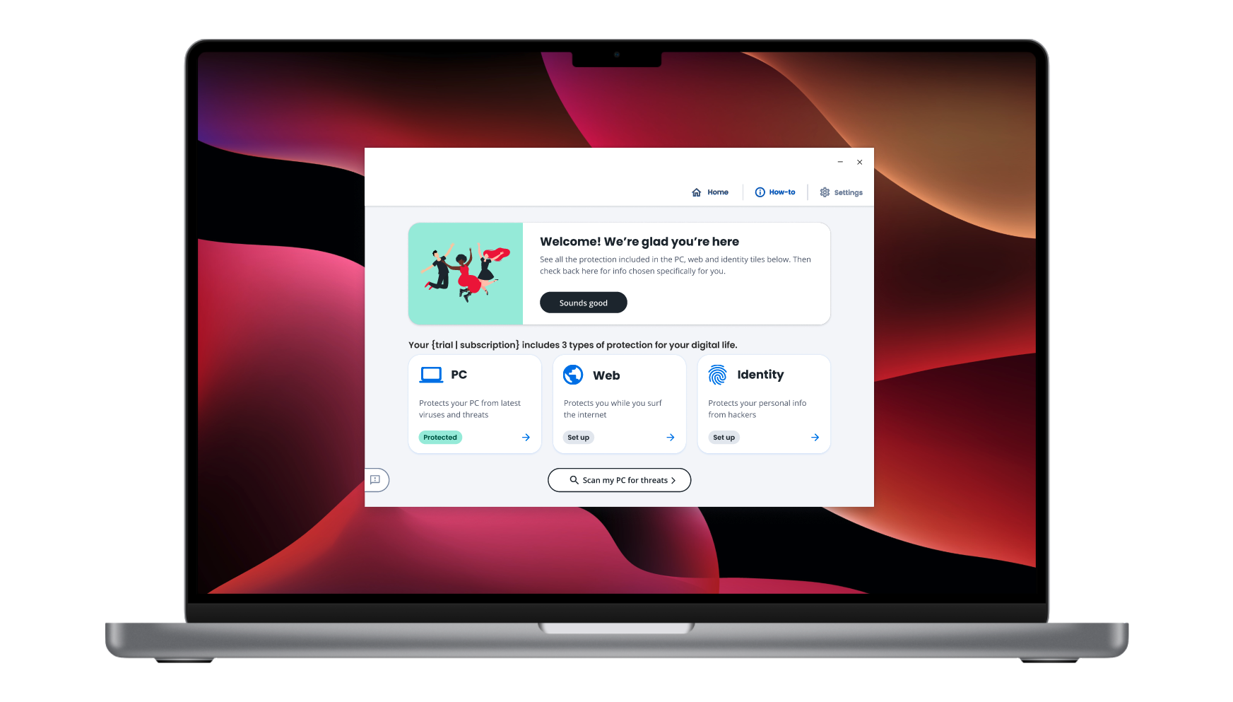
Entry #1: Our user will visit the “How-to” page accessible from the product homepage.

Our user will click "Phone" to protect mobile devices. The "How-to" page has instructions on how to protect tablet, email, VPN, safe browsing, and smart devices. It also has Protection Score at the top.

An instructional video to assist with activation, QR code for easy app download, or optional phone number input for alternative download method.

The text message or QR code directs to the app store on any of the mobile/tablet devices to protect.

User downloads and runs the app to finish the installation process. The device is now protected!

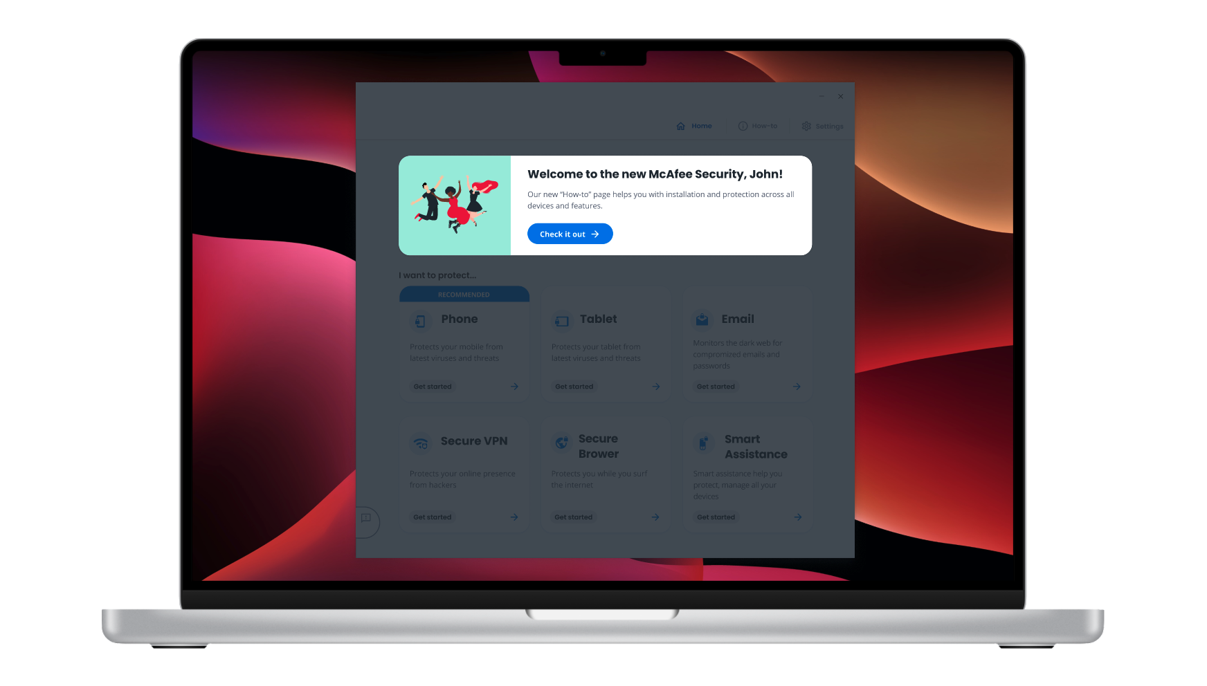
Entry #2: 1st Experience In-app Users are given a guided tour on their 1st visit of the product.

The homepage is modified to How-to page content for the guided tour.

The rest of the experience is same as Entry #1

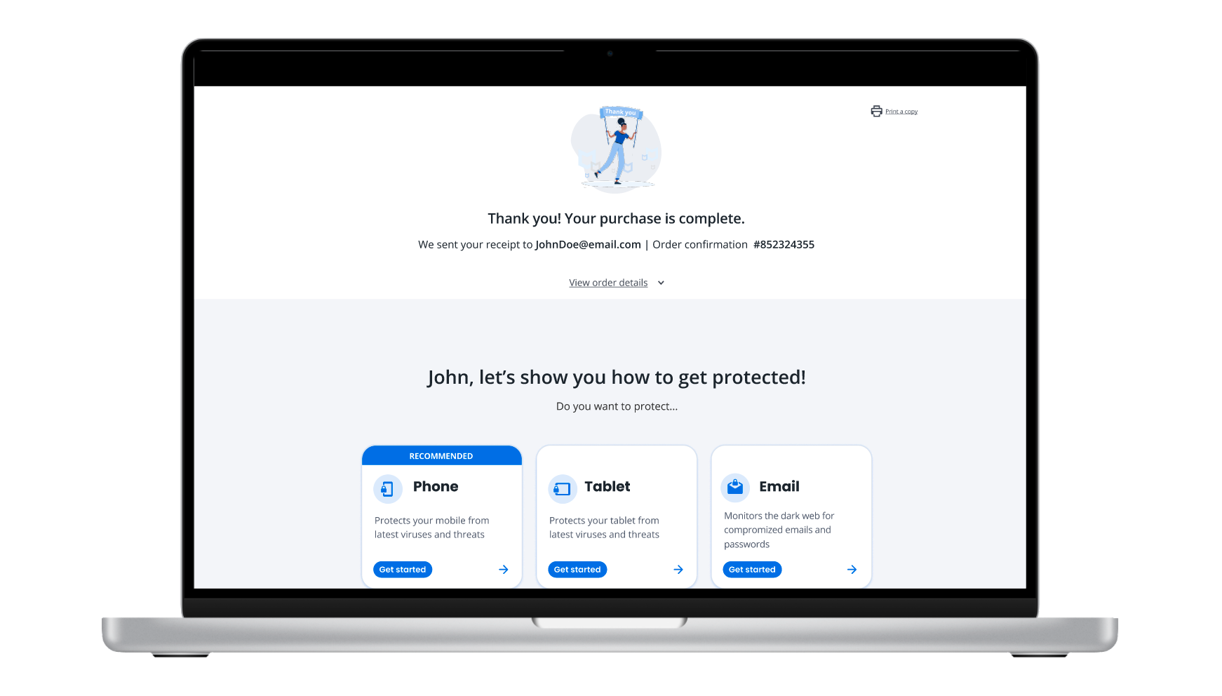
Entry #3: Cart Experience Users are purchasing the product.


Once purchase is complete, the same instructions are placed below the receipt, which are unexpanded in the landing page.

Entry #4: The Confirmation Email Once the user receives the confirmation email after purchase, they will get the same info if they skipped from previous landing pages.

The link from email takes to the landing pages.
Problem
The user purchased a multi-device antivirus software, intending to protect as many devices in their life. But the user didn't protect their phone or tablet because they weren't sure how and felt intimidated. The user is feeling frustrated since that's the reason for the purchase.
Solution
Our team built a QR code for mobiles and tablets to download the product app to get protected. We also included an instructional video on all platforms to assist users with the product activation.
This activation info first gets displayed below the receipt in the cart experience. If the user misses, it re-appears in the confirmation email. It happens lastly on the product's first experience page and forever lives in the "How-to" page of the product. As soon as the product detects the user has engaged with the info, it stops showing in other cadences to reduce over-communication.
In this scenario, our user will visit the "How-to" page located on the product's homepage. The "How-to" page contains resources to get protection started for mobile, tablet, email, VPN, safe browser, and AI devices. Our team also designed a Protection Score to ensure key safety info is easily updated and digestible to our users.
Responsibilites
This was a 2-day event and as the only Visual Designer of the team, I created user journeys in all touchpoints (product/cart/email/mobile) and interactive for the presentation. The following images showcase some of the experiences and different touchpoints.
It was an exciting and thrilling opportunity to come together with a reason to innovate.

